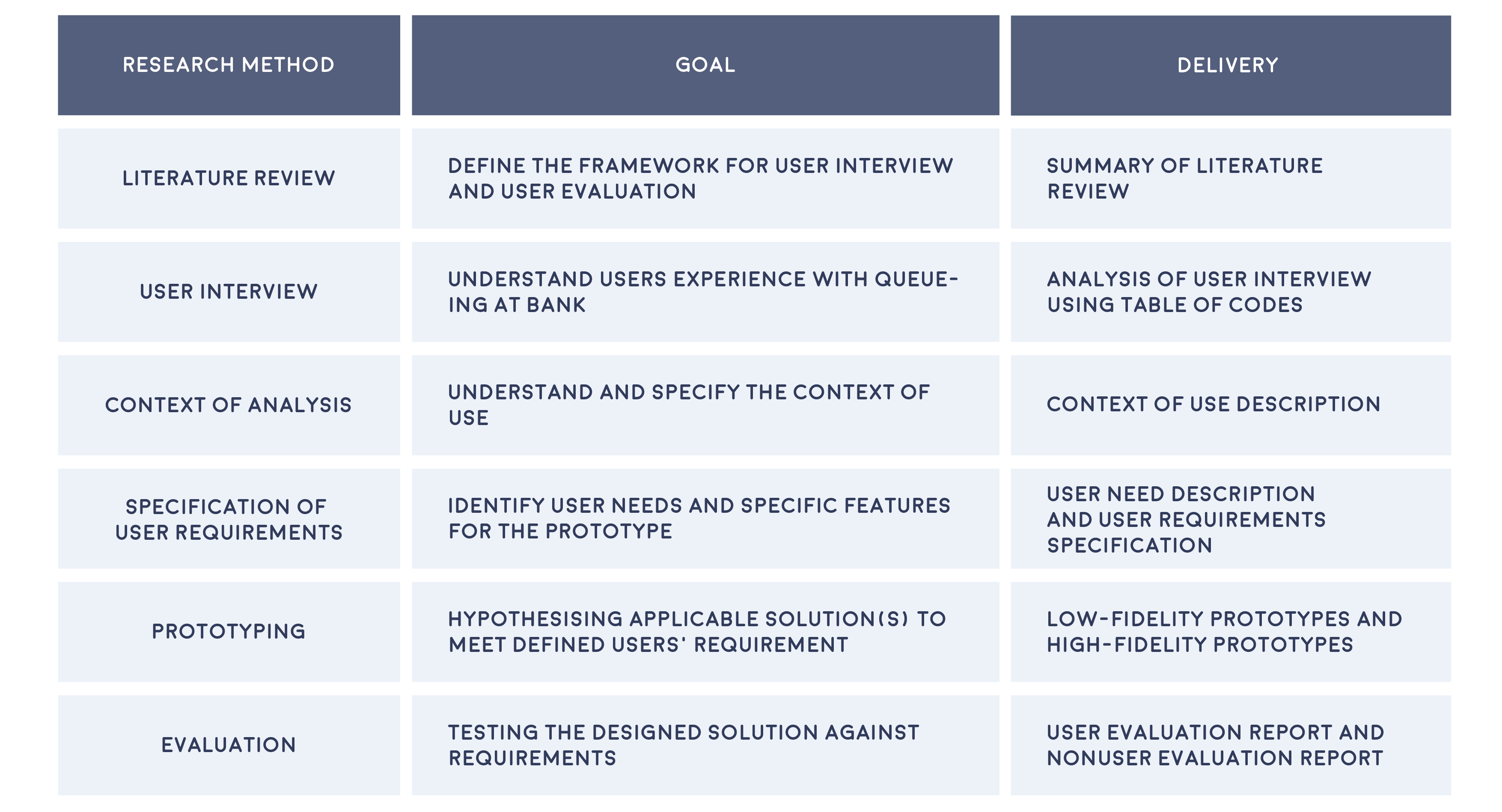
#HCIMasters #Dissertation

Bank Queueing Mobile Application

OverviewBusiness ProblemDiscoveryDefineIdeationEvaluationFinal Design

Overview

Finally...It came to the end

For my master's graduation dissertation, I decided to design a mobile queueing system for retail bank to improve customers' queueing experience at the bank based on the HCI principle and methodology. Despite the advancement in technology, in-branch service is still critical for bank industry as many people are still relay on it. And also, I was inspired by my own negative experience queueing at the bank in UK.

Project Aim

The aim of this project is to design a user-friendly electronic queue management system for the bank branch which can help reduce customer anxiety and stress to improve customers’ physical experience in bank branch. To address the goal, two research questions are defined:

1.    What is (are) the solution(s) to reduce customers’ stress, anxiety of uncertainty and unfairness while they are waiting?
2.    What factors influencing usability of mobile queuing application for retail bank?

Research Methodology

This project is based on Human Centered Design cycle, following the framework suggested in BS EN ISO 9241-210:2019.

Detail

Role: UX Researcher and Designer

Type of Project: Mobile Application Design

Duration: 2 months

Purpose: Academic

Disclaimer: This feature has already been launched by Certinia. All data and name included in the prototype are entirely fictional and intended solely for demonstration purposes. For more information and latest updates, please read Certinia official release notes.

Discovery

Literature Review

Before starting the project, I researched the psychology of queuing to understand customer behavior and dissatisfaction. In short, satisfaction depends on the gap between expected and actual wait times—when the wait is longer than expected, dissatisfaction increases. Since waiting is unavoidable in retail banking, managing customer expectations is key to maintaining satisfaction.

User Interview

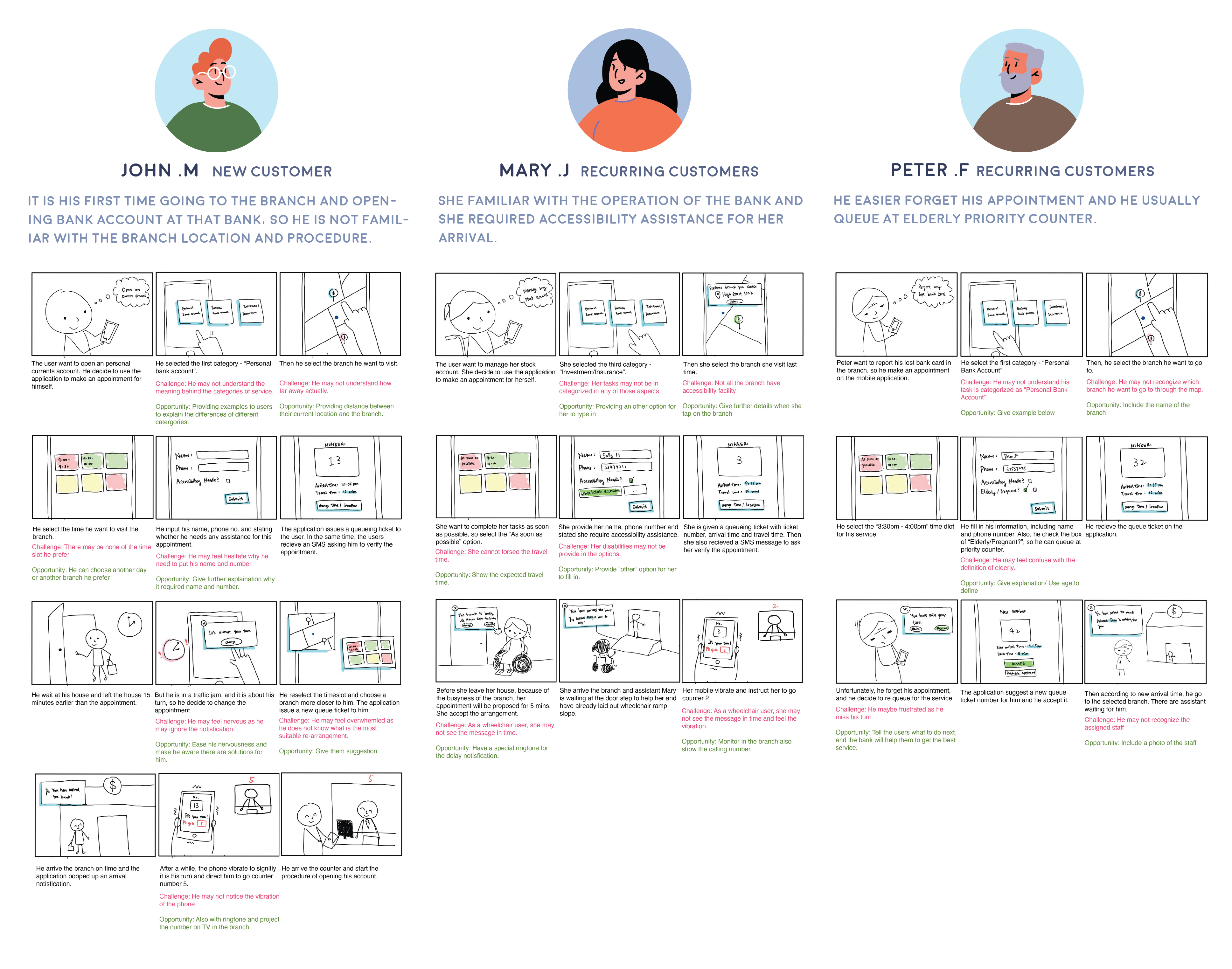
User interview is used to collect qualitative data about user’s experience of queueing in bank branch and bank technology, to identify users’ need in a queueing management application. The interview is around 15-30 mins, conducted physically or virtually depends on interviewees’ geography locations. The research have recruited 11 interviewees in total.

Result

Who is our user?

The interview results showed that most participants are purposeful bank customers—they visit the bank with clear, specific goals and aim to complete their tasks efficiently. Additionally, the majority prefer online banking over in-person visits, viewing physical branches as a last resort. This suggests that requiring them to visit a branch may already trigger a negative emotional response.

What is the pain points?

1. Interviewees believe queuing in bank physically is time wasting.
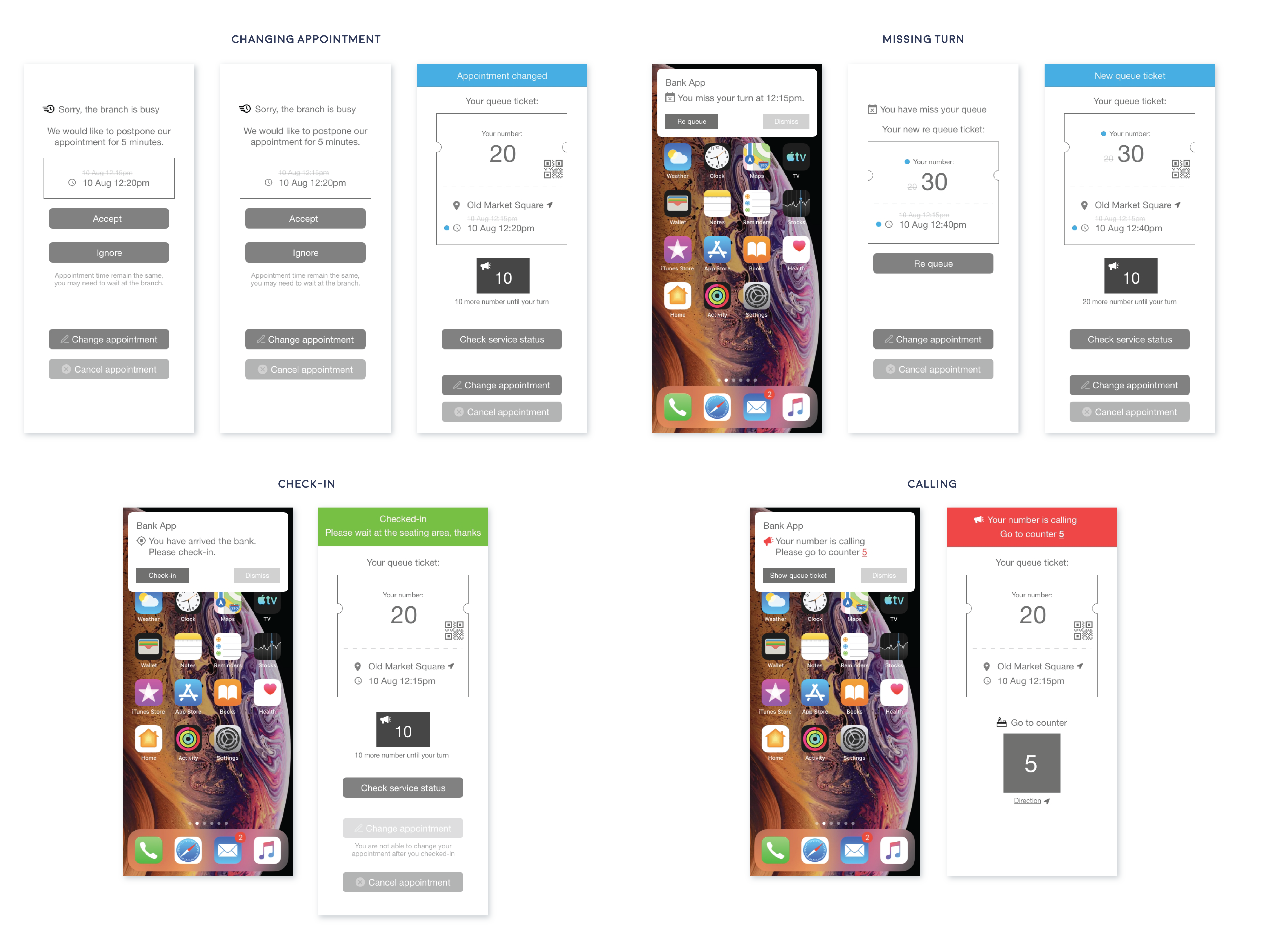
2. Uncertainty in queueing caused frustration.
3. Branches’ operations lack transparency.

How user feel about current bank technology?

Most of the interviewees reflected that they are familiar with bank technology, especially mobile banking applications and various payment methods. The most valued aspect of technology is security, ease of use and efficiency.

What is users' expectation?

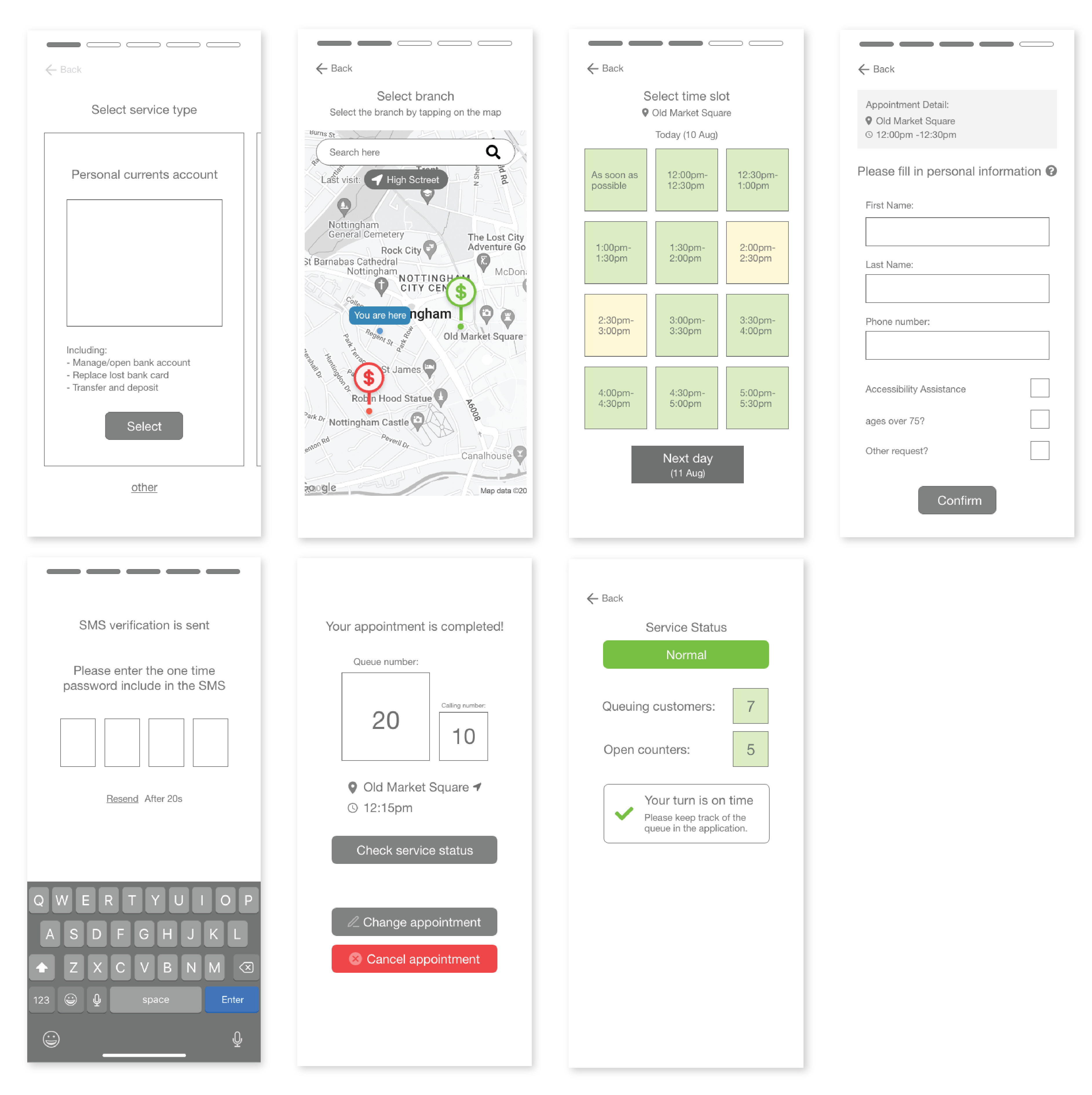
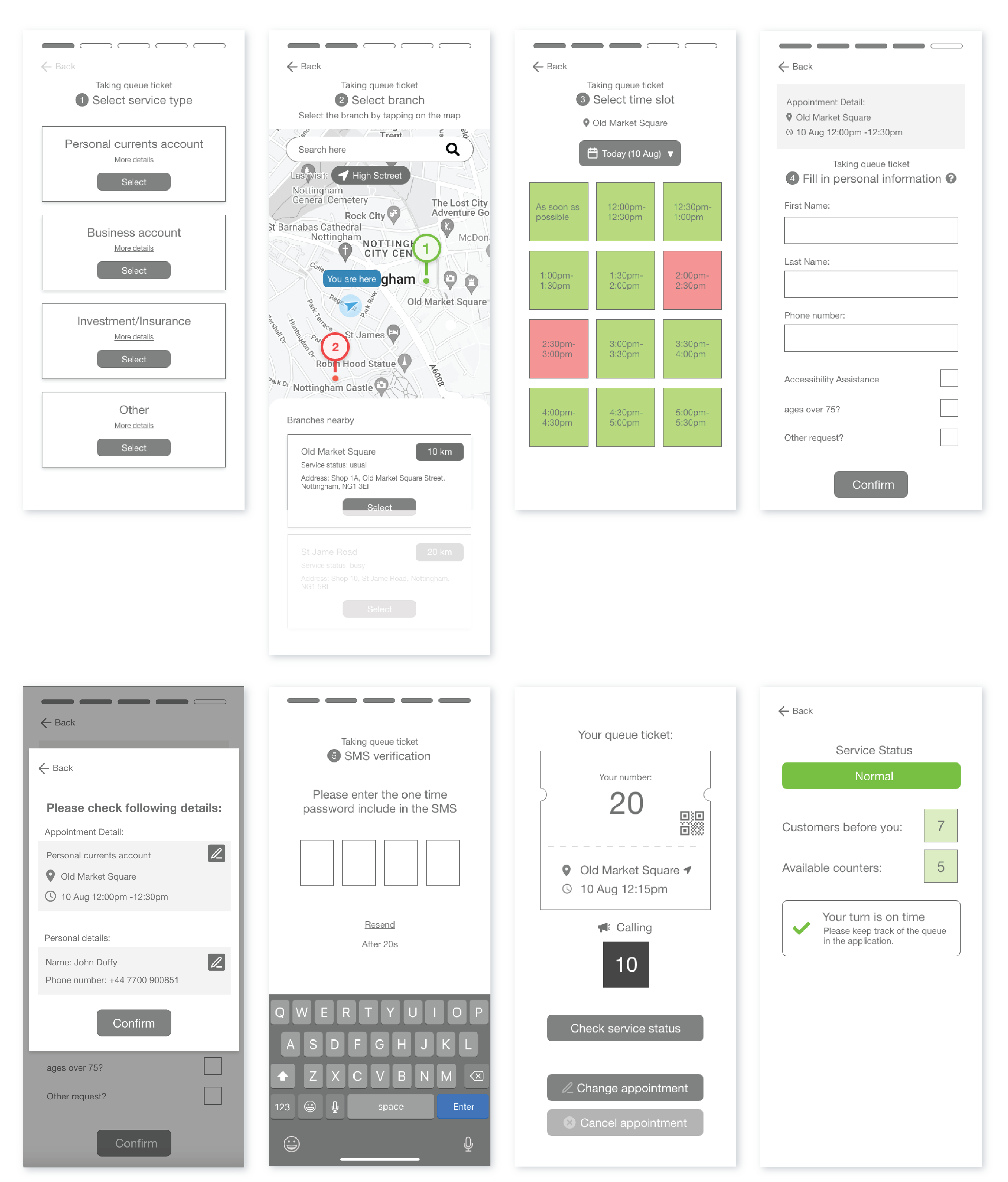
Most interviewees prefer remote ticketing more than physical ticketing. The rationales include saving time, reducing waiting time, helping to schedule daily agenda more efficiently, which relates to time efficiency. Interviewees also expressed their concern and limitation about appointment system, such as appointment system may restrict flexibility and providing inaccurate arrival time by not considering real situation of the branch.

The most suggested feature is live estimated waiting time, suggesting how long-time customers should arrive at the branch avoid waiting physically.

Business Problem

As a bank, we aim to improve customer's in branch experience by reducing customer frustration during quoting, which can help us retain customers and attract new customers.

Define

User requirement Specification

To prioritise user requirements, Kano questionnaire is used to collect potential users’ weighting on the importance of product requirements and 40 responds are collected.

In total, there is 19 users requirements are identified, which 13 of them is functional and 6 of them is non functional.

Functional user requirements

Non-functional user requirement

Ideation

Storyboard

Storyboards are created to represent 3 different personas user journey. Those personas represent customers with different abilities, characteristic and type of customers

Wireframe

According to the above three storyboards, initial version of the wireframe of the applications are designed.

According to the above research, appointment feature and notification are the most critical features to users. Therefore, the first prototype is focus on those two functionalities of the application.

Screen for appointment user flow
Screen of notification

Evaluation

User evaluation

The goal of user evaluation is to examine prototypes’ usability based on users’ perspectives and behaviours through qualitative research. In the first section, users are assigned with 2 tasks to be completed with the prototype; In the second section, interviewees are shown with 4 different messages to identify, which aim to evaluate the clarity of the messages. In the last section, semi-structured interview is conducted to collect interviewees’ opinions about the overall prototype.

6 participants from previous user interviews are recruited. They are around 20-30years old, 50% is male and 50% is female.

Result

Most interviewees found the application easy to use and navigate, as the task flow aligned with common sense. However, some faced challenges in specific areas:

  • Service Selection: Users were confused due to a lack of explanations about the different service types.
  • Branch Selection: Selecting a branch on the map was difficult since locations were displayed without names or distance from the user.
  • Queue Ticket Page: The layout caused confusion, as users found the queue number and current number too similar in appearance and wording.
Notification Issues:
  • Delay Notification: Users felt the options forced them to accept the bank’s arrangement, even when delays were due to the bank’s inefficiency.
  • Missed Turn Notification: Some wanted more flexibility, preferring to reschedule their appointment rather than just acknowledging the missed turn.
  • Branch Arrival Notification: Most interviewees found it unnecessary, as they believed they could recognize their own arrival.

Icon & Symbol Confusion:

Multiple users found the change icon unclear. Its design, color, and use of a red exclamation mark led some to misinterpret it as an error or mistake.

Non user evaluation

Combination HTA and SHERPA non-user evaluation methods are adopted in this study. A combination of both methods is used to predict the error and provides a thorough understanding of the possible errors as well as likelihood, severity, mitigation strategies of each task.

Result

The main concern is incorrect information is obtained as users are required to access much information about branch and bank service to complete queue ticketing, therefore it is critical to migrate risk of misunderstanding. To migrate risk of misunderstanding, replacing text with more visual presentation, as users may have different interpretation with the terms. Also, information is easily omitted as users may miss the update of service status, which is critical as it influences the user’s expectation with waiting time, causing dissatisfaction, and reducing application efficiency. To migrate to the chance of information being omitted, users are notified through multiple channels, such as SMS, email or call.

Final Design

Based on previous usability test and non user evaluation, the design was iterated and here is the final design:

Appointment

a. Service type selection:

Instead of presenting options of service types using scroll view, it is replaced by a list in vertical layout, which helps improve visibility by revealing provided options all at once.

b. Branch Selection:

List view is added, and the branches are in ascending order according to the distance between users and the branch.

c. Time slot selection:

To fulfil users’ requirement, the calendar feature is added to allow users to select another desired date for their appointment easily.

d. Personal details and confirmation:

A confirmation page is added after users confirm their personal details. The confirmation page allows users to recover from their mistakes by allowing them to edit appointment details and be notified with the choices they made.

e. Queue ticket:

A simplified visual presentation of queue ticket is used to present the details of user’ queue ticket. Besides, the QR code is added in the queue ticket to increase the security of appointment.

Notification

a. Delay notification:

The attitude of message is more apologetic. Besides, the application provides another option for users to react with service delay to improve flexibility; Users can select “Option” to review and compare suggested solution and alternative options, including changing the appointment to other branch and time, cancel the appointment or remain the original appointment, which help improve visibility of the result of their actions.

b. Missing turn notification:

When users click on “Re queue”, the application presents the proposed new arrangement of the appointment before they confirm to re queue, also alternative options are presented, which given users higher degree of controllability and visibility of the result of their decisions.

c. Check-in and Calling:

The UI text of both arrival and calling messages are updated; In the arrival notification, the text of button is reversed from “Check-in”from “Check queue ticket”, and for the calling message, the text of button is replaced to “Show queue ticket”. The context of “Check-in” and “Show queue ticket” are more instructional, which allow users to understand next steps they should process more precisely. Besides, feedback after user check in the branch and user’s instruction while their queue number is called are placed at the top of queue ticket to notify with the update of queue status.

Reflection

1. Lack of resource and time

As this project was lack of resource and time, I was not able to conduct field study to examine the effectiveness of the design. Therefore, the iteration focused on usability. Because of the same reason, only limited number of participants were recruited for research, which the result may lacked of validity

2. Lack of involved professional

Since it was my master dissertation, I was the sole contributor in the project. Therefore, the project was lack of opinions from different principles and professionals.

For more information, please check out the link below
Read More

Thank you

Feel free to check out my other works

Feature Design
Value Tracker
December 1, 2024
Read More
Personal Project
SingSmart
June 27, 2024
Read More
Feature Design
Guided Scoping
April 18, 2024
Read More
Feature Design
PSA - Calendar Component
July 1, 2023
Read More